Are you thinking about designing a new logo for your company? If you are, it helps to be on top of all the hot logo trends businesses are using this year.
This article will give you some inspiration so you can create something bang on trend but also unique and exciting.
Current Logo Design Trends

Over the past few years, we’ve noticed some big things happening in the world of logos and branding. This is a rapidly changing space in which contemporary style and marketing best practices combine to help businesses make a real statement.
Of course, your logo will be a personal thing, representing the style and identity of your brand. Despite this, it’s still important to stay on top of the latest trends in this field, learning all about what today’s customers engage with.
So, let’s take a look at the new logo design trends to watch out for this year.
From idea to reality in minutes.
Create your online store quickly and easily.
No complicated procedures or technical knowledge required.
Simplification
It’s easy to overthink your logo, adding many different elements that you think represent your business. However, try to avoid this temptation. Over the past year, many brands have taken the simplified approach. Keeping it simple and striking can leave a profound impression on your audience.
It is easier for people to recognize and remember simpler logos, helping you to promote your business and build long-term relationships. Simplistic style also presents your business in a positive light, demonstrating your commitment to neat, tidy, well-organized professionalism.
Geometric Shapes
A geometric shape is a two-dimensional image with closed sides – think triangles, circles, squares, or more complex design elements like trapezoids and dodecahedrons. You may have noticed these shapes in some of your favorite modern design logos.
Consider incorporating geometric patterns as a border or a backdrop – the closed line of the shape creates a solid boundary within which to build your logo.
Alternatively, you might decide to build geometric shapes into your text, replacing the dot of an i or j with a circle, for example. The more basic nature of a geometric shape makes it perfect for exploring the simplification logo design trend we’ve discussed above.
Handwritten and Hand-drawn Logos
In this increasingly digital world, AI-based images are causing quite a storm, generating intrigue and controversy in almost equal measure. However, many consumers still want to see a bit of authenticity and humanity from the businesses they interact with, and a handwritten or hand-drawn logo can be perfect for this.
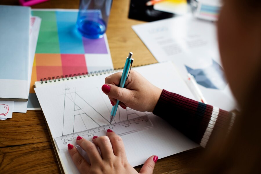
Using digital drawing tablets, you can create sleek script fonts that your customers will engage with. You may also want to use freeform drawing on elements of your logo to foster a deeper connection with your audience and successfully communicate your brand message.
Many business types – interior design firms or vintage clothing outlets, for example – will find that this is a very rewarding approach. However, it might not be quite suitable for tech firms or web developers, so remember to consider the nature of your market when you choose a logo.
Monoline Designs
Monoline design is a way to keep things simple and straightforward while still achieving eye-catching and visually striking results.
The technique involves using a single line weight across the whole design – essentially, all of the lines you use to create the logo are the same thickness, color, and depth. There is no variation in line texture across the entire design piece.
You can use this to create a simple logo or build more complex and sophisticated patterns without changing the line thickness. Experiment with different monoline drawings, adding or removing elements of complexity until you settle on one that best represents your brand.
Minimalism as a Logo Trend
Minimalism is similar to simplification, but there are a few key differences.
The main difference is that simplification is a more general process of creating a basic design, while minimalism involves selecting and accentuating the most important elements of the design through the use of simple shapes, lines, and typography.
Consider what best represents your brand’s visual identity – an image you want people to associate with your company.
With minimalist logo designs, this identity takes center stage, with little or nothing else around it to distract the customer, except for a simple shape or text. A minimalist approach can be highly effective for companies that want to distill their ethos and approach into a single, memorable image.
Most designers use outline styles, clean lines, and line art to create minimalist logo designs. More and more brands are transitioning into a simple representation of their brand. Louis Vuitton is an example of brilliant use of simple typography, while Airbnb keeps its logo light with a very simple graphical logo.
Negative Space
Negative space is a long-standing art and design concept, but it is becoming a hot new logo design trend this year.
Basically, negative space, or white space, refers to all the areas of the design you’re not using. So, if your logo consists of an image that takes up the bottom right quarter of the design, the other three quarters are your negative space.
The smart use of negative space is an important part of minimalist and simplified logos. The technique produces a crisp, clear visual with a fresh appearance whose main goal is to create contrast.
This draws the audience’s eye directly to the most important parts of the logo, removing all other elements that might distract or overwhelm. Depending on the industry your business operates in and your business identity, this can be a valuable technique.
Gradients
One of the trends we’ve picked up on this past year is a move away from block colors in favor of more dynamic transitions in various color palettes.
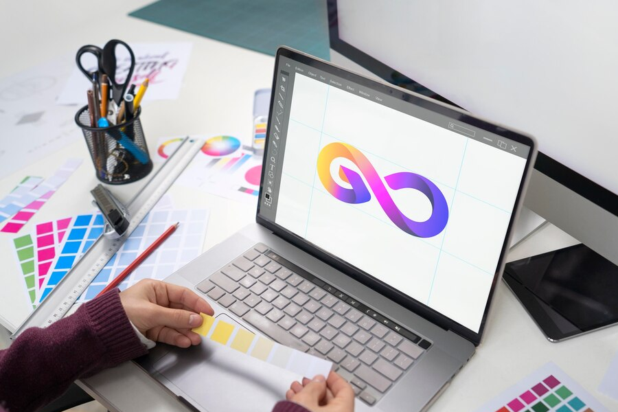
Perhaps the most striking of these transitions – and the one that is all the rage in the 2023 logo design community – is the color gradient. This creates an effect similar to pencil shading, in which a deep, dark color gradually transitions into a lighter color as the eye moves across the surface.
Using this technique, logo designers can bring life and movement into designs that might otherwise be a little plain, creating layered letter logos or designs with areas of textured color.
Gradient coloring manages to be subtle while still offering visual interest to your target audience and can help differentiate your brand from your competitors.
Flat Design
Flat design is an interesting option that accentuates a two-dimensional effect within your logo.
Artists and graphic design professionals often try to make their work stand out in three dimensions, adding perspective to create a three-dimensional effect. Flat design avoids this altogether – the logo is created with a head-on point of view, so it looks flat and flush against the surface.
You can still add shading and different textures to give the image a bit of life. However, the idea of flat design is to avoid angles of perspective, crafting a sharp and simplistic image that can leave a lasting impression on your audience.
As the gradient technique we mentioned above tends to give the impression of perspective, you might be better off using subtle block colors if you adopt the flat design approach.
Responsive Logos
A responsive logo is not so much a design technique as it is more of a method of achieving consistency for everyone who interacts with your brand.
In today’s digital world, your logo will be seen in different contexts, from laptop screens to smartphone interfaces, as well as on more traditional signage and fliers. That logo must be consistent across all these differing user experiences, helping you promote a strong, unified brand image to your audience.
When your customer opens your page on their computer, your responsive logo will display as normal. If they switch to a mobile or tablet device, such logos will adapt to the new screen and will appear exactly how you want it to. This is a great way to present a professional image to your audience.
Vintage or Retro Design
This run-down of the top logo design trends for this year is not supposed to be a checklist – instead, it’s supposed to provide you with some inspiration as you develop this cornerstone of your brand identity.
One logo trend may contradict one another, so it’s up to you to choose which one best fits your industry and the specifics of your organization.
Vintage logos and retro designs are good examples of this – while they go against the simplified and minimal principles we’ve already discussed, they can be a great fit for businesses that want to exude a timeless or retro quality.
Crests and classic serif fonts coupled with aged-looking or sepia tones can provide a strong vintage look for your business’ logo. Explore some of the popular brand logos of yesteryear and gain more insight into how you can make this work for your own company.
Abstract Shapes and Patterns
You don’t necessarily have to feel bound by geometric shapes or more straightforward patterning. Often, a more abstract approach can make your logo stand out from the rest – and we’re seeing lots of businesses take this more individualized route in 2023.
An abstract design may use concentric or overlapping elements, or irregular fluid forms that refuse to be classified. You can still adopt a minimal approach to make the core messaging stand out, but the abstract approach gives you a bit more design freedom. Just remember to make sure your logo reflects your brand identity and values.
Bold Typography
What happens when you’re reading a sentence and suddenly there’s a WORD that’s capitalized and set in bold type? Your eyes are automatically drawn to this word. While there are many different ways to use bold typography in your logo design, all are aimed at grabbing the attention.
Less is more when it comes to the bold approach of typographic logos or wordmark logos. If EVERY WORD IN A LONG PARAGRAPH OF TEXT IS BOLD, your message might get lost in the noise.
But, if you’ve got just your company name and a short, sharp slogan in there, the bold typeface can really stand out. You can also bold lowercase letters if this fits your brand identity. This ensures your logo gets noticed and can help with brand awareness.
Cut-out Shapes
Cut-out shapes can help you add depth and texture within your design. Rather than building design elements on top of one another, a cut-out process takes the opposite approach – key design components are cut into other parts of the logo, creating a visually intriguing effect for your audience.
By defining your boundaries and adding shading, you can ensure that these cut-out shapes are just as eye-catching and exciting to your audience as more traditional designs.
Duotone and Multicolor Designs
If you want to create something a little different from the popular but simple black-and-white logos, a duotone design is highly effective in reinforcing the colors and textures that make up your brand identity.
You probably have a color palette that is associated with your business – and which is woven into your web design, your promotional literature, and all other client-facing areas of your organization. Choosing the two main colors from this palette and working them into your logo creates a strong focal point for your brand.
You may have more than two colors that you want to use during your logo development process. This is fine – you can create a multicolor design with three or more different shades and textures, incorporating bold or neon colors if you want to make a statement.
Just remember not to overdo it. Unless a busy and chaotic mix of colors is part of your brand‘s unique personal style, limiting your color scheme to three or four different hues is probably best.
3D and Dynamic Logos
Once upon a time, your logo would have appeared on your storefront, in your physical advertising, and nowhere else. Nowadays, though, it will appear all over the internet as your audience interacts with your business across a range of digital devices.
With a 3D or dynamic logo, you can take full advantage of the capabilities of these devices.
A 3D logo will be rendered in three dimensions, giving your audience a striking and professional-looking image to engage with.
A dynamic design, on the other hand, may be used in animated logos, or it may change shape and size when your audience interacts with it. It can even be used for glitch logos, which appear to break apart, or ‘glitch’ when the user encounters them.
Remember to make sure the logo remains recognizable and retains your core brand identity in its design – then use 3D or dynamic design capabilities to bring the logo to life.
Incorporating Brand Values and Messaging into Logo Design
Creating a logo is about more than producing a nice-looking image. Graphic designers are using these trends to craft logo designs that represent the identity and ethos of the brand, and this must always remain at the heart of the design process.
So how is this done? How do you make sure the design of your logo features your key brand values and messaging? Let’s take a look.
Consider Your Brand Story
What kind of brand story are you trying to tell? How would you describe your brand identity?
Answering these questions will give you an idea of what you are trying to convey as you design your logo.
Distill the Core Elements of Your Brand Value and Identity
Your logo needs to be super concise and immediately impactful. You haven’t got much space to play with here, so you must pinpoint your key elements.
Decide on what is most important about your brand identity and try to work this into your design.
Think About Associations and Visual Psychology
Consider the psychology of your chosen colors – fiery reds and oranges convey urgency and vibrancy, while neutral blues, greens, and browns inspire calmer, more natural feelings.
The same can also apply to shapes and patterns – strong lines and hard angles might give the impression of security and professionalism. In contrast, softer, free-form shapes offer a friendlier, more approachable effect.
You may also combine two completely different styles, shapes, or fonts to create contrast. For example, some brands use classic Serif fonts and Sans Serif fonts coupled with modern ones to evoke a sense of traditionalism, blended with a modern touch.
Test Different Options
You might need to gain an outside perspective as you design your logo. Complete a few potential designs, and then run these past your colleagues and partners. You might even want to reach out to your customers to determine which option they are most engaged with.
Navigating Logo Design for Different Industries or Niches

We’ve already touched on this above, but your visuals must represent your industry and brand. A vintage logo might not be the best fit for a future-focused SaaS provider. Similarly, a crisp, minimal design might not get the message across if you provide barber services or sell vintage fashions.
Think about the core aspects of the industry you operate in.
If you work in security or data protection, your logo will need to double down on the reliability and robust nature of your solutions. If you’re in the healthcare field, you need a reassuring, calming logo that is also professional. If you are in the childcare field, you might need something more fun and frivolous. Take a look at some of your competitors to learn more about the prevailing trends in your industry, and then try to create something that incorporates these logo trends while still setting you apart.
Frequently Asked Questions
What are the biggest logo trends in 2024?
Minimalist logos, color gradients, and lots of white space – these are some of the top logo trends you should follow as a business or a graphic designer. Responsive and dynamic digital logos are also big.
Should I use the simple black-and-white logo design trend?
Simplified black and white logos can work well, but you need to consider your brand identity, messaging, and the industry you operate in.
What is negative space in logo design?
Negative space, or white space, is the blank area of your logo. Leave these spaces free, creating a contrast that draws attention to your key messaging.
Can I get a professional logo from NEXT BASKET?
The NEXT BASKET team offers great logo design services to help you stand out from your competitors. Together, we can create visuals that set your business apart from the rest. Reach out to get started or read on to learn more about the latest trends.


